Friday, 26 February 2010

Audience Research Update

To gain some basic audience research I asked three people who fitted the Indie/Rock music genre to answer a few questions on what they thought of the magazine.

1) Does this magazine fit in with the Indie music genre?

2)Would you say the font connotes rebellion?

3) Do you think the colour scheme works or would you change it?

4) Would you say that this magazine appeals to a female audience as well as males?

5)What is your favourite part of the whole magazine?

6) Which part is your least favourite?

Friday, 12 February 2010

Finished Production Work; Double Page Spread

This is the final finished copy of my double page spread interview of my cover band The Blank Canvasses for my magazine; Unplugged!


Finished Production Work; Contents Page

This is my final copy of my finished contents page for my magazine; Unplugged!


Finished Production Work; Front Cover

This the final copy of my magazine front cover that I have named Unplugged!


Monday, 8 February 2010

Photo Update

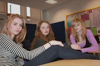
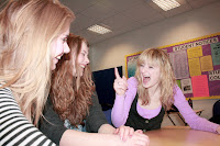
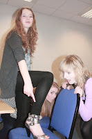
My audience have said that they like these photos for the double page spread;


They say that these photos connote a fun and informal side to the band which also reflects the Indie music genre. As my audience is aged between 16-24 and may be college students, they like the idea that some one who is just like them can make it big in the music industry.

The simple background makes the reader concentrate on the people (subject) of the photo itself rather than the background behind. This also reflects the Indie music genre.

Thursday, 4 February 2010

Photo update

These are the choices for the photos for my double page spread.


Production Update

Front Cover - I will try to make the Exclusive! bubble in the corner neater and more rounded.

Contents Page - I will alter the small spelling mistakes (three).

I will complete these alterations tomorrow morning before moving onto my double page spread.

Time Keeping Update: As we missed a couple of lessons due to the snow, and recently exams, I am around on lesson behind. However I will write the double page spread contents at home ready to type up either tomorrow or Monday.

Production Update

This is a completed copy of my contents page.


Tuesday, 2 February 2010

Production update

In my first copy of my contents page, that I completed on Quark Express, the font sizes for the text and page numbers were too big and took up to much room on the page. Similarly I didn't know how to add a semi-circle in the top left hand corner, drawing the attention to the exclusive preview of the next issue on the back pages. For this issue I had to make one in photoshop before transfering it over into Quark express.

Other issues that I have had is the size of the pictures inside the contents. Some lose their quality when they get smaller. To rectify this issue I have altered some of the frame sizes so that each photo is different sizes. This also links in with Indie genre of being rebellious and going against the mainstream.

However I have managed to follow my main design feature of yellow and black as the main colours for the magazine. These also stand out to the audience as black on yellow are two easiest colours to see against one another (even over black and white). This is why they are used on hazard symbols and therefore gives the reader a sense of danger and rebellion, linking back to the Indie genre. I have also followed the diagonal masthead idea onthe front cover which connotes a level of similarity and could be seen as the magazines trademark.

Photo update

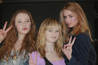
My target audience said that they liked this picture the best;


They said it was because it shows the band smiling and pulling faces. This connotes the informality, fun and youthfulness of the magazine; thus reflecting the target audience and Indie genre. However they said that it might be interesting to cut around the group so that it didn't have any of the background in it.

Photos for contents page

These are the selection of photos that I will show my target audience to see which one they prefer on the contents page of my courserwork. I took the band in the photography room with the plain background behind them.


They will then give me their feedback and I will decide which photograph I want on my contents page.