Friday 29 January 2010

Production Update

This is what my front cover looks like after I moved in into Quark Express.


However the cover shot prints out too dark so I will go back to photoshop to edit the photo so that it prints out correctly. I also had to edit out the background so that it looked more professional and neater. I did this by choosing by chopping out the background by using lasso and then finding a similar colour to the bottom part of the background and painting over the white background.

Tuesday 26 January 2010

Final draft of cover

This is my final daft of my front cover, after making final changes that my audience suggested. I will then move this over to Quark Express from Photoshop and neaten the lines and edges of the masthead and Exclusive bubble.


Monday 25 January 2010

Photo Update

My audience said that they preferred this picture for the front cover;


However when I tried to use this picture with my drafted background the masthead and the exclusive bubble covered band member Leah's head and face. As shown below;


Their second favourite picture was this one;


that I now have to use on the front cover design.

Also I showed my audience the full preview of what my front cover my look like and whether they thought it reflected the indie genre.

They said that the colours were too bright for the indie genre and thought that the picture would look better in black and white. This matched the white main sell and coverline along with the black masthead. They also said that as Indie music connotes a more metallic look that the purple could be replaced with either a gold or sliver and maybe with dark colours for the font i.e. black and white.
They also said that the font may be more of a girly type font and should be more plain to reflect Indie genres idea of focusing on the music. Similarly they also said that they would prefer a normal circle for the win! bubble instead as it seemed almost childish and took attention away from the music.

Sunday 24 January 2010

Photos

These are a selection of the photographs that I took of my cover band, The Blank Canvasses, on the 21st January in the college's photography studio. These will be the choice of which pictures will go on my front cover, I will then ask a group of my target audience which photo they would prefer on my front cover and why.


Production: Final draft of front cover (PC)

This is the final copy of the cover draft of my magazine.


Positives:
  • Like the font size and style - reflects the Indie Genre well.

  • Like the colour designs of purple and blue as it is not just a boy colour and not just a girl orientated colour.

Negatives:

  • The space may be an issue for the picture. You can either make the mainsell and coverlines smaller to look less cluttered, narrow the strapline at the bottom of the page or make the masthead and the exclusive bubble behind smaller.

Thursday 21 January 2010

Production: Second draft of front cover (PC)

After taking all of my audience's comments on board I developed my second draft of my front cover design on Photoshop.


Positives:
  • Like how the masthead is at an odd angle - connotes fun and informal air to the magazine.

  • Like how the cover and strap line is set out- equally spaced so that the reader can read what the main sell of the magazine is without having to read a whole lot.

  • The informal language - appeals to the teenage audience.

  • Evenly spaced out.

  • Like the puff - informal and draws in readers as it gives them something that the other magazines can't.
Negatives:
  • If the competition bubble was moved down then both the main sell and coverline could also be moved down leaving enough space so that the readers can see the cover shot fully.

Production: First draft of front cover (PC)

This is the first draft of my front cover, done on photoshop. After doing this I asked members of my audience to rate what they thought of the cover so far.


Positives:

  • Like the fun symbol that the competition is in - connotes a fun, informal side to the magazine and draws the readers eye.

  • Like the colour scheme - doesn't appeal to only a single gender i.e blue for boys, pink for boys. In fact it almost specifically targets both genders as the purple could be seen to attract more girls whereas the light blue could attract boys.

  • Like the Exclusive Artic Monkeys CD Preview that is in the top left - draws the reader's eyes and the exclusivity of the preview attracts a wider audience as it gives them something that other magazines don't.

  • The language is informal - appeals to the teenage audience and the small, sharp amount of information allows the reader to see (and get a general idea) of what is inside the magazine without having to read big, bulky text.
  • Like the slanted masthead idea - conntoes a fun and informal side.

Photo update

20th January 2010:
I have decided to scrap the school outfit idea as my actors didn't like it because they said that it didn't suit the genre and also it would have been to hard to do as hardly any of my actors had the appropiate clothing needed. Instead the actors will wear classic indie clothes. All the other photos for the contents page will remain the same.

Thursday 14 January 2010

Research and Planning: Shot Lists

For the next part of my media coursework I will be planning the shots that I will take to appear in my magazine. These will appear in my front cover, contents page and my double page spread.

Cover:

  • A large shot of the cover band will cover most of the page. The cover band that I have chosen is the three piece girl band; The Blank Canvases. This establishing shot will be a Long Shot of the band, playing fun, inflatable instruments that I have at home. They may also be wearing funky glasses. As the band are still at college they will be wearing a typical school uniform yet in Indie style; plain black skirt or trousers (maybe even skinny jeans), plain button down white shirt that may be left open to revel a colourful or rebellious t-shirt underneath, the school tie ridiculously small and maybe heels or if not flats. The band may be wearing bold make up e.g. dark black rimmed eyes and bright red lipstick or really colourful eye make up designs. It will be taken from either straight on and facing the band or slightly underneath them with the camera tilted upwards. The photos will be taken in the photography studio in college which has a blank white background which I can edit detail or colours into it later in photoshop. The lightening will also be bright and at eye level with the band. I will be using a 12MP camera so the photo quality will be clear and at their best. I will be providing the props but my actors are bringing their own clothes to wear. I will also be providing the camera.
Contents Page:
  • MS/Head + Shoulders of the band together. Will not be wearing the glasses and I may use a fan, placed underneath the band, given their hair a windswept effect. The lighting will be bright and the photograph will still be took inside the college's photography studio. The band may be striking a pose, e.g. V sign etc to give a fun and informal effect.
  • LS of the band You Me At Six took at their concert at the Birmingham NIA last year. The lighting will be a mixture of bright (around the band) and dark (behind them) as the band were on stage performing at the time, therefore they won't be looking straight at the camera. The band provided the venue, clothes (which are informal) and props (e.g. instruments) whilst I took the picture.
  • MS/LS of the local band City Walls stood together outside the Cathedral. The lighting is bright and the band will look relaxed and informal. There will be no props in the photo so that the reader fully concentrates on the band and their music. The band will be providing their own outfits for the shoot.
  • LS of the band Vampire Weekend at their concert last year. The lighting is bright and the clothes and props are informal and relaxed; the props especially will be minimalistic. This photo will probably be used as part of a competition and I may edit the photo in photoshop to attract the audience.

Double Page Spread

  • Large photo of the cover band, The Blank Canvases. This maybe spilt into three or four different segments as then it can zoom into each member of the band. As the cover shows the rebellious school theme I will taking the photos in an abandoned classroom inside college. The photos will then show the band sat inside a normal classroom yet they will be showing some form of rebellion towards authority e.g. a member of the band getting told off by a teacher yet not really taking much notice, members of the band throwing a paper balls around the classroom or even doodling on the desk. I will try and blur the background of the photos slightly as this will draw the readers attention to the band members rather than the background behind them. They will be wearing the same outfits as on the cover and I may get some of my other friends to act out being other members of the class or maybe a teacher. If so the other students will be wearing a normal school uniform whilst the teacher will be wearing a suit or a smart jeans and a shirt.

Wednesday 13 January 2010

Research and Planning: Update

Due to the continuing bad weather I have had to change the dates for my time plan.

Instead of the 13th January I will have;
  • Found models for my cover band.
  • Found an appropriate location, time and clothing for the models.
  • Found the necessary props in order to shoot the photos, by the 17th January.

Instead of the 15th January I will have;

  • Taken all of the appropriate photos (for both the cover, contents and the double page spread), by the 19th January.

Instead of the 17th January I will be;

  • Ready to move on to the post production stage, by the 21st January.

Research and Planning: Time Plan

It is essential that I keep to a time plan as this allows a higher level of organisation to my work and therefore allows me to complete each aspect of my coursework effectively and to be handed in on time.

By the 13th of January I will have;
  • Found models for my cover band.
  • Found an appropriate location, time and clothing for the models.
  • Found the necessary props in order to shoot the photos.
By the 15th January I will have;
  • Taken all of the appropriate photos (for both the cover, contents and the double page spread).
By the 17th January I will be;
  • Ready to move on to the post production stage.

Research and Planning: Initial Planning (Double Page Spread)

After gathering my audience responses from my questionnaire I was able to put together a series of initial plans on what my double page spread may look like. I used their answers as it will therefore give me ideas on what my target audience would like to see in a new Indie/Rock music magazine

Idea 1:


Positives:
  • Easy on the eye - quick and simple to find out what page is number is what article etc
  • Not too much text - this keeps the reader interested and not to be put off by lots of writing. This appeals to the target audience as it connotes a youthful and informal air.
  • Like the quote boxes - interesting and something different. Also it picks out an important piece of the text so that the reader does not have to read all the way through it to find funny or important bits.
  • The uneven masthead - this keeps with the design of the contents page and cover, providing a theme and constants for the reader to identify with. The unevenness also appeals to the target audience as it provides a fun and informal air to the magazine.
Negatives:
  • No point to the design in the right hand corner. Not needed and irrelevant.
Improvements:
  • Get rid of design in top right as there is no need for it.
  • Add editor pick or something similar.
  • Add a prompt, e.g. go to our website to watch the rest of the exclusive interview.
Overall: 7/10


Idea 2:


Positives:
  • Like the logo of the band - gives the reader something to relate to and fans will be able to link the band with the magazine, providing a borrowed value.
  • Like the quote boxes - interesting and something different. Also it picks out an important piece of the text so that the reader does not have to read all the way through it to find funny or important bits.
Negatives:
  • Too much text - boring for the reader and the target audience of young people do not want to read lots and lots of text in articles.
  • Layout too messy - Too cluttered and this makes it harder to find key points etc.
  • The picture of the band is not big enough - looks like the text takes over from the photo and has priority yet the target audience does not want to read a lot of text.
Improvements:
  • Less text.
  • Clearer layout - stay in with the current theme.
  • Larger picture of the band.
Overall: 3/10

Idea 3:


Positives:
  • Well presented - easy to see where everything is and simple to find anything that the reader wants to.
  • The five facts - interesting and fun, which relates to the target audience. However they preferred the facts somewhere else.
  • How the masthead goes over the both pages - quirky and connects the pages together.
  • Like the burst (We Luv) - eye catching and is fun and informal.
  • Like the prompt to visit the website in the bottom right hand corner - prompts the reader to visit the websites other formats and therefore provides bigger audience appeal.
Negatives:
  • Don't like the banner - boring, the straight line across doesn't have any imagination and there is no need for it.
  • No need for two pictures - overloaded and too many and not enough text.
Improvements:
  • Use the band logo.
  • No need for two pictures.
  • No banner - boring.
Overall: 5/10

Overall my target audience preferred the first version. They liked the layout as it was evenly spaced out and the fun masthead, at odd angles, draws the attention to the magazine. The uneven and odd angles also connote the magazines fun, youthful and informal air, whilst having the similar mastheads for both the cover and the contents page establish a brand image and a theme. The odd angles also help to reflect the Indie music industry as it connotes rebellion against the mainstream magazine layouts and designs. They liked how there were quote boxes as it draws the readers attention and provides either a funny or interesting piece of the text that th reader can pick out quickly rather than read all the way through the text. The informal language also helps to appeal to the target audience of young people.

The improvements that they gave were to include a small burst, maybe an Editor's pick etc, which further connotes the fun, youthful and informal side to the magazine. To get rid of the design in the top right as there is no need for it and to add a prompt, similar to the one in Idea 3, e.g. go to our website to watch the rest of the exclusive interview. This also promotes the other media formats of the magazine, drawing more people into reading it and gaining a wider public knowledge.

Tuesday 12 January 2010

Research and Planning: Intital Planning (Contents Page)

After gathering my audience responses from my questionnaire I was able to put together a series of initial plans on what my contents may look like. I used their answers as it will therefore give me ideas on what my target audience would like to see in a new Indie/Rock music magazine.

Idea 1:

Positives:
  • Interesting to look at - draws the readers eye without looking to overbearing or lopsided.

  • How the contents is broken down into sub-categories -makes it easier to read and therefore the reader is able to take a quick look at the contents, is able to find what they are looking for or interested in quickly, without having to read a lot of text.

  • Like the prompt in the top left hand corner - gives the reader an added extra that other magazines don't provide. It also allows the reader a chance to see the next issue and have a rough idea on whether they will buy it or not.

  • The masthead - the odd angle connotes fun, excitement and informality which will appeal to the target audience of young people. The sideways cut banner also resembles the front cover design with the masthead, therefore providing a theme and a brand image.

  • The informal language of the sub-categories in the contents - this appeals to the target audience of young people as it connotes a fun, informal and laid back approach.
  • Like the pictures - This shows the audience what is inside the magazine without going into lots of detail, therefore allowing the reader to take a glimpse of what is inside without having to read a lot of text and appealing to the target audience of young people.
  • Like how the page numbers are inside the picture - easier and quicker to find by the reader.

Negatives:

  • The letter from the editor could be smaller - the target audience of young don't find it interesting and the fact that the letter tries to make it seem that the editor is a real person and provide a relationship with the reader doesn't appeal to them.

Improvements:

  • Smaller letter to the editor.

Overall: 8/10


Idea 2:


Positives:

  • Modern language - appeals to the target audience of young people.

  • Kept writing to a minimum in the contents - less to read and therefore the reader can see what is inside the magazine without having to read a lot of text.

Negatives:

  • Don't like small picture of the cover - Irrelevant and is just a waste of space. You can turn over to the front cover to see it, so why have it there as well.
  • Layout is boring - split too much i.e. all the pictures on one side and writing on the other. No real imagination and is just boring to look at.

  • Contents is just too square - boring and doesn't catch the readers eye.

Improvements:

  • Smaller letter to the editor.

  • No picture of the cover inside the contents page.

  • Mix up the layout so that it is not too split up.

Overall: 3/10


Idea 3:


Positives:

  • Easy to see what's there - clear and simple for the reader to find out what's inside the contents without having to read through a lot of text.

  • Modern language - to appeal to the target audience of young people.

Negatives:

  • Not enough pictures - too boring to look at and nothing catches the reader's eye.

  • Layout too boring - too split i.e. all pictures on one side and the text on the other.

  • Text in the contents page too long - too much to read and the audience won't be bothered to read it all when they could just flick through the magazine.
Improvements:
  • More pictures.
  • Less text in the contents page.
  • More interesting layout.
  • Maybe include an editor's pick of the week

Overall: 3/10


Overall my target audience preferred the first version. They liked the layout as it was evenly spaced out and the fun masthead, at odd angles, draws the attention to the magazine. The uneven and odd angles also connote the magazines fun, youthful and informal air, whilst having the similar mastheads for both the cover and the contents page establish a brand image and a theme. The odd angles also help to reflect the Indie music industry as it connotes rebellion against the mainstream magazine layouts and designs. They liked how the contents was split into sub headings so that the reader can find the thing that they want easily and quickly. The informal language also helps to appeal to the target audience of young people.

The improvements that they gave were to lessen the writing in the letter to the editor as the target audience finds it unnecessary and a waste of space. The same could be said about the front cover inside the contents page. Finally they said to include a small editor's pick of week etc., maybe in a small star shaped bubble, to appeal the the audience and further connote a fun and youthful side to the magazine and therefore draw in the target audience.

Sunday 10 January 2010

Research and Planning: Initial Planning (Front Cover)

After gathering my audience responses from my questionnaire I was able to put together a series of initial plans on what my magazine cover may look like. I used their answers as it will therefore give me ideas on what my target audience would like to see in a new Indie/Rock music magazine.

Idea 1:


I then asked a new set of participants to rate the idea out of ten and gives me both positives, negatives and possible improvements on the idea.

Positives:
  • The star - makes it look fun, informal and exciting. It was also the first thing what drew their eye.
  • Well layed out - not to cramped or one sided and the star is in the perfect position as it then draws you to the main sell.
  • How the masthead is placed - the odd angles, bold letters and size draw your attention to the masthead and establishes a brand image.
Negatives:
  • Less writing in the strapine for each point - too much to read and the audience may get bored.
  • Main sell could be bigger - so that it draws in the reader.
Possible Improvements:
  • Larger main sell
  • Short, sharp points in the strapline.
Overall rating: 8/10

Idea 2:


Positives:
  • Well spaced out - easy to read and not over crowded. This links with the Indie genre as it therefore focuses on the music and the articles rather than fancy cover designs.
  • Mainsell is based on a fun design - connotes an informal and youthful to the magazine.
Negatives:
  • Boring - Doesn't grab attention as much.
  • Some bits too lopsided.
Improvements:
  • Add more interesting eye catching points.
Overall: 6/10

Idea 3:


Positives:
  • The stars in between the points on the strapline - gives a fun, youthful and interesting feel.
Negatives:
  • No set layout - bits everywhere and has no real order to the magazine.
  • Too square - boring and doesn't attract your eye.
  • The circle is also boring - too plain and doesn't attract your eye.
Improvements:
  • Make it more fun e.g. adding stars instead of the circles for the competitions.
  • Make the layout more ordered - not everything in the top half.
Overall: 4/10

Overall my target audience preferred the first version. They liked the layout as it was evenly spaced out and the fun star symbol draws the attention to the magazine. The uneven and odd angles also connote the magazines fun, youthful and informal air. The odd angles also help to reflect the Indie music industry as it connotes rebellion against the mainstream magazine layouts and designs. The improvements that they gave were to lessen the writing in each point in the strapline as it will allow the reader to read and gain all the information about the articles in the magazines without having to read lots of information. Finally they said to make the mainsell and coverline stand out more so that it doesn't get overshadowed by the fun and funky star shaped freebies.

Audience Research: Results of Questionnaire

Friday 8 January 2010

Audience Research: Mood Board and Questionnaire

This is my audience mood board that I will show to members of my target audience so that they can evaluate my preliminary ideas for my magazine. I will then give them a questionnaire to fill in and then put this data into graphs so it will be easier to compare and gain results.


This is a copy of my questionnaire that I will be giving my target audience to fill in.

Questionnaire

After looking at the mood board provided, please read the questions below and answer them to the best of your ability.

1. What genre would you say this magazine represents?

2. Which magazine name do you prefer?

3. Looking at the 2 types of font which one do you like best and why?

4. Which type of bands would you prefer to see in the magazine?

5. Would you like to see competitions in the magazine? Please give one example.

6. What sort of price would you pay for this product?
- 50p-£1 -£1.10-2.00 -£2.10 - 3.00 -£3.00+

7. Do you like the extra features in the magazine? E.g. Send in your demo, CD and concert reviews and music charts?

8. Which one do you like the best?

9. Would you like to see a more fun side to the cover band/artist? E.g. inflatable guitars, funny glasses etc.

10. Would you prefer a girl or boy band on the cover?

11. What colour scheme would you like to see?
-Red/Black -Purple -Blue -Green -Other -Don’t Know

12. Which color is best for the masthead or title?
-Red -Black -Yellow -Other -Don't Know

Monday 4 January 2010

Preliminary Audience Research

For the next part of my research I will conduct some audience research. By using different forms of media I will interview a sample of my target audience on what they would like to see in a new music magazine and what design features they believe would suit the genre.

Genre: Rock/Indie.

Age Range: Between 16-24 and usually still in some form of education e.g. college or university. They probably have some form of job e.g. part time waitress and therefore have a disposable income to spend on the magazines.


Jicnars Scale: C1/C2. They are between average to above average intelligence and come form a working class to middle class background. They a part of a normal family with a normal house, car, jobs etc.


Psychographic Profile: The profile for the readers of my magazine are; Hedonists - 'to play and enjoy life now', Radicals - 'really individual, do what they want, when they want to', Post materialists - 'to be something later' and Post modernists - 'to have, to be, to play'.
They don't care what others think and live in the moment rather than planning out their future.


They hate to follow the mainstream and prefer new, up coming artists like Taken By Trees than established artists like Girls Aloud. They prefer underground gigs than sell out concerts, buy all their bands albums rather than download the singles, are good with technology as many of their favourite bands may only have access to sites such as Myspace and Facebook etc, love going out to parties and staying out all night and wear tight shirts, skinny jeans and most likely play an instrument such as drums or guitar.


While I will be concentrating on Indie music as a genre my magazine will also try to target a wider audience than just Indie music lovers. My magazine will be distributed by Frontline as they have the power to get the magazine into bigger consumer shops such as HMV or Tesco. However the key point is that the magazine will be first and foremost an indie magazine, dedicated to Indie bands and artists. By using a large distributor bands such as Taken by Trees and The Dodos will be able to target a wider audience, which may then make them more popular and have a wider fan base. This will then allow people who have never heard of their music before the chance to listen rather than always having to listen to the generic pop in the charts.

Research and Planning: Distribution

The next part in my research was to look at distribution networks; both major and independent.

Major distribution strategies aim to saturate the market, both home and abroad, by promoting their magazine in major retail stores such as Tesco, Sainsbury’s and HMV. As their product is massed produced they are able to sell their magazine at a lower price, invest in new artists for their covers and provide freebies and competitions which will attract a larger audience to their magazine therefore selling more magazines and making more money, something that major distribution companies strive for. The four main distributors for the magazine industry are Marketforce, Comag, Frontline and Seymour.

To gain more information about major distribution companies and their ways of distribution I researched Frontline.

Frontline was formed in June 1986 by the magazine publisher Emap (now Bauer Media) in order to handle the demands of their expanding circulation department.
Frontline has four main partners; Seymour, Haymarket, BBC Enterprises and H Bauer publishing. This increases market share and dominates the industry, providing many different sources of revenue and more profits for the company. Frontline sells and distributes over 160 magazine titles, including 54 of the top 200 best selling titles in the UK and by selling nearly 8 million copies every week, through over 55,000 shops ranging from the smallest corner store to the biggest hypermarket, makes them the biggest magazine distributor in the UK.

Frontline provide comprehensive Supply Chain support in the U.K. and Ireland extending from the new product launches and new issues to liaison with Printers and the management of Finishing, Transportation, Subscriptions, Export, Copy Management, Wholesalers, Statistical Analysis, and Supply Chain Development including retail service improvement.


Frontline cater for all genres, from music to self help and for many different audiences. Popular, well known magazines that they distribute are; Heat, Bella, Kerrang! and Q.


Independent distribution companies have very different market and promoting their magazines than the major companies like Frontline. Whereas the major companies focus on profit, independent companies concentrate on the audience and the individuality of the magazine. They are small, maybe even home run and concentrate on distributing their magazines to urban, underground shops or online. In fact vice have their own television channel called VBS.tv - http://www.vbs.tv/

Whilst this limits the audience and the public knowledge of the magazine, by selling the magazine to a limited audience it weeds out the people who aren't really fans of the genre of type of magazine and allows die hard fans to keep up to date. With the popularity of the Internet growing every year, the independent companies have used this to their advantage. Whereas as before breaking into an abroad market may have been almost impossible, yet with the help of the Internet fans from all over the world can access the magazine. An example of independent magazine distribution is Vice. Vice sells their magazines mainly online and through some select independent record stores such as Tempest and Studio 4 in Birmingham. As they don't worry about profit margins or making money they are not afraid to do something different even if it may offend some people. Their marketing program is much the same as the major companies but on a much smaller scale. The majority of Vice readers are male, aged between 21-30 and are generally big spenders yet are loyal and trustworthy customers who like to be involved with the bands and the making of the magazine as well as finding out about the band first rather than the music.

Example of Vice magazine;


My magazine is going to be based on the rock/indie genre, with an audience profile of C2/D on the Jicnars scale and a psychografic profile of hedonists, radicals and post modernists. I would like my magazine to appeal to a more mainstream audience, as from previous research I have discovered that there is a gap in the market for a magazine that aims to make rock/indie music more cool and appeal to a wider audience. Therefore for my magazine I would want it to be sold in more mainstream shops such as Tesco and HMV rather than select specialist stores as it provides a bigger shop window for my magazine to be marketed from. To do this I would want my magazine to be distributed by a large major distribution company such as Frontline.

Saturday 2 January 2010

Evaluation of Detailed Research

After completing detailed research into three different magazines from the rock/indie music genre that I have chosen to concentrate on. These were Kerrang! NME and Under The Radar. By doing this I have discovered design features that I may incorporate into my magazine.

Genre: The genre for my magazine will be a cross between a rock and indie music magazine as I believe that they blend together well and many of the styles and tastes in music overlap. I also believe there is a gap in the market for such a magazine.

Audience: The audience for my magazine will be mainly aimed at males, yet I will try and make the magazine appeal to females as well. They will be aged between 16-24 with a jicnars scale of C1/C2 and a psychographic profile of hedonists, post materialists, radicals and post modernists. The majority will be students or people with a disposable income. They will have an interest in music, e.g. playing an instrument (maybe guitar and drums) and prefer small underground gigs to sell out concerts. They may have long hair and wear tight shirts and skinny jeans. They will be good with technology as my magazine will have lots of online extras.

Title: The masthead for my magazine needs to be short, sharp and easy to remember. This will therefore help to build a brand name for readers to connect with and feel a part of. It will be bold, in capitals with exclamation mark and in a sans sherif font as this is appeal to the target audience as it connotes a fun, lively and informal air to the magazine. The capital letters and exclamation mark will connote it's importance.

Style: The colours in my magazine will be natural rather than artificial and be more simple then detailed and fancy. This links back to the genre of the magazine as it will allow the reader to concentrate on the music and the contents of the magazine rather than the fancy cover designs. The layout of the magazine will be simple as well; one main photograph that takes up the cover, maybe with a couple of smaller photographs to show what else is inside, with coverlines and straplines that show some of the content in the magazine. The font style will most likely be in sans sherif font that suggests informal, fun and youthful air to the magazine. To further appeal to the target audience the strap and cover lines may be at odd angles.

Content: Inside my magazine the content that readers should expect to find are interviews with both popular and upcoming artists, competitions, reviews on albums (done by readers, other artists and the editor). My magazine will also have a fans page where readers can send in their views and comments on anything from articles to albums, similar to the fan page in Kerrang!

Mode of address: The magazine will use a mixture of direct and non direct language to address the reader; the direct language will engage the readers interest and make them feel part of the magazine whilst the non direct language will save them from being overloaded with information etc.

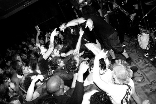
Photographs: The main photograph will be of a popular band in the Rock/Indie music industry. Most likely to be a MLS to a LS and took in a natural setting. Simple back ground which draws attention to the artist rather than the background. The artists will be looking straight at the audience, engaging them and making the interaction feel more personal. This will also connote openness and friendliness.

Contents page: Simple layout with clear colour scheme and design. One half of the page will dedicated to the text of the contents page which will be separated under smaller headings, and the most of the other half done with pictures along with small straplines and page numbers telling the reader where they can find that particular article. There will be a small note form the editor and with it a small version of the cover. This makes the magazine more personal and gives the reader a sense of openness and familiarity. The text will use informal language which connotes a sense of fun, casual and relaxed magazine.

Double Page Spread: A full featured interview with a popular or new and up coming artist/band within the rock/indie music industry. There will be a full or half paged photograph that will dominate one page along with a heading and strapline. These will be done in sans sherif font what connotes a fun and informal side to the magazine. The background will be simple and not be distracting for the reader. The magazine will also use informal language. This provides a baseline fro the rest of the magazine to follow and therefore cementing it's trademark and brand image. The sans sherif font also connotes a more fun, laid back and causal style to the magazine.

Publisher:
Polestar or IPC Media.

Distributor:
The distributor needs to be fairly mainstream as my magazine will try and break into the mainstream. For my distributor I have decided to use Frontline.