Wednesday, 10 March 2010
Friday, 5 March 2010
Question 6
Over the course of creating this music magazine I have used many different desk top publishing software. These include SLR Cameras, Photoshop, Quark Express, Blogger, Windows Movie Maker and Slideshare. In this question I will evaluate how this new technology has helped me to
The first technology that I used was the SLR Cameras.
By using these cameras I was able to get a sharper image (15.1 mega pixels resolution), better focus and overall better quality of picture that I used throughout my magazine. The cameras were important in getting the right image as the sharper resolution allowed all the different colours and shades to show up clearer on the magazine. The technology also allowed me to upload and view the pictures quickly and effectively and, with the use of e-mail and memory cards, I was able to view these pictures at home without taking the actual camera home. The speed and effectiveness of uploading the camera photos allowed me to quickly view them and make any adjustments using the image manipulation software.
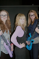
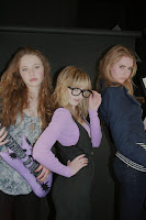
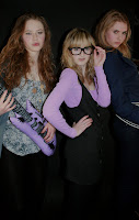
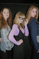
Here are some examples of the quality of pictures that I was able to take with this camera;
Adobe Photoshop
Photoshop is a graphics editing program developed and published by Adobe System. It is the current market leader for image manipulation software, and is the flagship product of Adobe System.
Adobe Photoshop was a key part of my media coursework. As I have used Photoshop for around three years-for photography and art coursework purposes- I was already familiar with the program and decided to use it when I designed my front cover. By using Photoshop I was able to upload my photos, which I had previously took with the digital SLR camera, and edit and refine them using the image manipulation software to create my main sell photo. Another thing that I was able to do on photoshop is erase the background of photos so that just the focus of the picture was on what I wanted it to be.
For example:
Similarly I was able to make my colour photos black and white.
E.g.
I chose to use Photoshop over Quark Express as I was able to edit and refine the photos that I had taken more effectively. Also by using the many layers I could document the progress of my magazine from beginning to end.
Through completing my magazine coursework, I learnt more about Photoshop, about its layers, font styles etc, the different shapes and line tools that could be used when creating straplines and screamers and how this can be an advantage when making images and backgrounds look more appealing and professional.
Quark Express
QuarkXPress ("Quark") is a computer application for creating and editing complex page layouts in a WYSIWYG (What You See Is What You Get) environment. It was first released in 1987, the most recent version is QuarkXPress 8 and it allows publishing in English and 36 other languages, including Arabic, Chinese, Russian, and Spanish.
QuarkXPress is used by individual designers and large publishing houses, primarily to produce any kind of layout, from flyers to complex page layouts required by magazines, newspapers, catalogs, and similar printed materials.
I used Quark express to create my contents page and double page spread. I chose to use this program because Quark has easy accessible tools, simple and effective to use and a range of page formats to start your projects on including A4 and A3. Choosing the correct page for my project (A4) I could immediately start work on the page layout and adding images and text. I learnt very quickly how to add text and images using the correct tools, tilt the mastheads so that they would follow one of the main design features that are shown throughout the magazine and also how to spilt the text up into columns on my double page spread so that the page looks more professional and gives the effect of not having as much to read for the audience. This was especially helpful to me as my target audience of young people don't want to spend their whole time reading a long article. It also allowed the text to follow neatly and more professionally over both of the pages.
I was shown how to move the text around quotations and photos I had around my text (in my double page spread), how to make an overlapping text box for the subscription box (in my contents page) and also how to make the editing look smooth, and professional. At first I found Quark a bit of a learning process and difficult to use yet after completing this coursework I are capable and proficient enough to complete similar tasks and clearly this program was the best to use for my contents and double page spread.
Blogger
I have used blogger as my main record system of what I have done at any date and at any one time when showing all of my coursework. Over the course of my coursework Blogger has been incredibly useful as I have used it to keep a record of what I have done over the course of my coursework. This is helpful if I lose work or forgot where I am as I can look on my blog to see exactly what I was on and what I was doing.
Blogger is a fairly simple program to use and I was able to complete my research and planning quickly and easily. Blogger has especially helped me with my evaluation as I was able to add images, slideshows and embed videos onto my blog, making my evaluation more interactive.
Windows Movie Maker
Windows Movie Maker is a video creating/editing software, included in Microsoft Windows primarily in 2000. It contains features such as effects, transitions, titles/credits, audio track and timeline narration.
I chose to use windows movie maker for my evaluation as I have used the program many times before for previous coursework and feel confident using the program. I thought that it would be different, not just keep doing sideshows all the time and would make my blog more interactive.
By using this program I was able to make a presentation with the pictures and create titles and quotes to break up the pictures. I was also able to narrate my video and create different title effects and transitions between one picture to the other. The most common one that I used was fade in/fade out.
Slide Share
I used slideshare in my evaluation as it provides a go between of powerpoint and blogger. I had never used this site and program before but found it simple and easy to use. After completing my slideshow I was able to upload the slideshow to slideshare and then publish this slideshare onto blogger. This allowed my blog to be more interactive and different.
Question 5
It seems that the positives about my magazine is that it fit the target audience, appeals to both males and females and the indie music genre.
However, the negatives seem to be that the puff and the exclusive bubble in the top left hand corner could have been neater or if not, not used at all.
To get a more clear, in depth interview with members of my target audience I am going record their interviews on a digital SLR camera. This allows me to get a closer and more valid view of what my target audience really think about my magazine.
After interviewing three people who were part of my target audience, I feel that I have established who they are, targeted them effectivley and overall got mainly positive feedback. The criticism which I did get I could use to explain how I would improve my magazine. This is evidence that I have targeted my audince effectivley.
Thursday, 4 March 2010
Friday, 26 February 2010
Audience Research Update
Friday, 12 February 2010
Finished Production Work; Double Page Spread
Monday, 8 February 2010
Photo Update
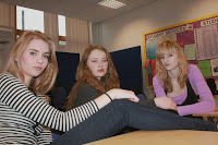
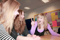
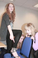
They say that these photos connote a fun and informal side to the band which also reflects the Indie music genre. As my audience is aged between 16-24 and may be college students, they like the idea that some one who is just like them can make it big in the music industry.
The simple background makes the reader concentrate on the people (subject) of the photo itself rather than the background behind. This also reflects the Indie music genre.
Thursday, 4 February 2010
Production Update
Contents Page - I will alter the small spelling mistakes (three).
I will complete these alterations tomorrow morning before moving onto my double page spread.
Time Keeping Update: As we missed a couple of lessons due to the snow, and recently exams, I am around on lesson behind. However I will write the double page spread contents at home ready to type up either tomorrow or Monday.
Tuesday, 2 February 2010
Production update
Other issues that I have had is the size of the pictures inside the contents. Some lose their quality when they get smaller. To rectify this issue I have altered some of the frame sizes so that each photo is different sizes. This also links in with Indie genre of being rebellious and going against the mainstream.
However I have managed to follow my main design feature of yellow and black as the main colours for the magazine. These also stand out to the audience as black on yellow are two easiest colours to see against one another (even over black and white). This is why they are used on hazard symbols and therefore gives the reader a sense of danger and rebellion, linking back to the Indie genre. I have also followed the diagonal masthead idea onthe front cover which connotes a level of similarity and could be seen as the magazines trademark.
Photo update
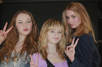
They said it was because it shows the band smiling and pulling faces. This connotes the informality, fun and youthfulness of the magazine; thus reflecting the target audience and Indie genre. However they said that it might be interesting to cut around the group so that it didn't have any of the background in it.
Photos for contents page
Friday, 29 January 2010
Production Update
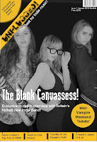
However the cover shot prints out too dark so I will go back to photoshop to edit the photo so that it prints out correctly. I also had to edit out the background so that it looked more professional and neater. I did this by choosing by chopping out the background by using lasso and then finding a similar colour to the bottom part of the background and painting over the white background.
Tuesday, 26 January 2010
Final draft of cover
Monday, 25 January 2010
Photo Update
However when I tried to use this picture with my drafted background the masthead and the exclusive bubble covered band member Leah's head and face. As shown below;
Sunday, 24 January 2010
Photos
