Thursday 31 December 2009

Detailed Research into Forms and Conventions Part 3 - Under The Radar

For the final part of my detailed research into current popular magazines is Indie magazine Under The Radar.

Brief Introduction: Under the Radar is an American indie music magazine that bills itself as "The solution to music pollution." It features interviews with accompanying photo-shoots, opinion and commentary on the Indie music scene and reviews on books, DVDs and albums. The magazine has been in publication since late 2001 and is issued quarterly each year, with seasonal Winter, Spring, Summer and Autumn editions. The magazine was founded by co-publishers and husband and wife Mark Redfern (Senior Editor) and Wendy Lynch Redfern (Creative Director and main photographer) and they still run the magazine to this day.


  • Has twice been nominated for the Plug Awards as Magazine of the Year.

  • Was the first American magazine to interview the following non-American bands:The Aliens, The Long Blondes, Taken by Trees, The Thrills and Young Galaxy.

  • Under the Radar is published and distributed independently by a husband and wife partnership.

  • Has presented indie rock concerts.

  • Has gained a large Myspace following through its group by the same name, as well as by hosting various groups dedicated to the many artists popularly featured in the magazine.

  • Is sold in most American record stores and book stores: Barnes and Noble, Borders and Virgin Megastores amongst others.

  • Helped to break such artists as Fleet Foxes and Vampire Weekend, being the first nationally distributed print magazine to interview either of those bands.

The magazine also posts web-exclusive interviews and reviews on their website from time to time.

Research:

Genre: Indie

Audience: 16-25, mainly males with a psychographic profile of hedonists, radicals and post modernists and materialists. The Jicnars scale is around C1/C2. They prefer such indie festivals like the Coachella than sell out at the O2 or Wembley. They drink beer rather than wine, wear skinny jeans and colourful wacky shoes, belts or ties. Are good with technology as many of the artists that they listen to are on Myspace etc. Mainly students with a disposable income and would rather spend money on CD albums from lesser known bands such as Taken by Trees than download them from big names like iTunes. They may be learning or have an interest in playing an instrument such as drums or guitar.


Title: The masthead is bold, in sans sherif font and is done in bold, ordinary colours such as black and sometimes red, blues or yellows. This connotes the simple but effective genre of Indie music and shows that Under the Radar concentrates fully on the artists themselves. The capital letters of the masthead connote the importance of the magazine and draws the readers eye as they feel that if they don't buy the magazine they may be missing out on something big in the indie music scene. The masthead is large and usually placed in the top left hand corner, further suggesting it's importance and the small symbol of the brand name inside. This establishes the brand image and makes the reader feel that they own a part of history and feel part of a group with other readers. The simple design appeals to their target audience as it allows them to fully concentrate on the music and not on the bright colours or fancy images on the cover.


Style: The main colours for the magazine are bright and in unusual shades e.g. in this case green and yellow, which connote a fun and exciting air to the magazine. The bright colours also attract the readers eye to the magazine and therefore may persuade them to buy the magazine. The font style is mostly sans sherif font, which suggest an informal and fun sense to the magazine. This will appeal to the target audience as the younger audience do not want to be overloaded with information. The layout is simple, the main article and focus point of the magazine (main sell) takes up the majority of the page with the smaller coverlines placed evenly at the top and bottom of the page. This simple design reflects the indie music genre of being simple but effective and concentrating solely on the music and not about fancy designs. The main sell coverline is placed at an odd angle, across the band The Dodos. This similarly appeals to the target audience as it connotes an informal, rebellious and exciting feel to the magazine. The rebellious side will attract the radical hedonists that read the magazine as they will enjoy reject mainstream values.


Content: Under the Radar features interviews with popular indie photo-shoots, along with opinions (both reader and expert) on the Indie music scene and reviews on books, DVDs and albums. Under the Radar pride themselves on introduced radical new bands to their readers attention and have been known as the first nationally distributed magazine to interview Fleet Foxes and Vampire Weekend, well known popular Indie bands. They similarly have artists Q & A's which allow the readers to feel a deeper connection with the band and allow a bond to develop as the reader finds out interesting facts about the artist. They have reviews on new and popular books and DVDs along with Indie albums and underground gigs. Some what they themselves have presented.


Mode of Address: The magazine uses short, informal, simple sentence structured language to address the reader. This connotes that the magazine is upbeat and informal which will appeal to a wider audience as therefore more people can understand and read the magazine. This also attracts the target audience as teenagers and young adults do not want to be overloaded with information to read at a quick glance. The simple sentence structured language in the cover and straplines also allows the reader to quickly gain a good insight into the magazine without having to read an awful lot. The magazine however doesn't use direct language that focuses on the reader e.g. 'you' or 'your'. This links to the style of Indie music as therefore the thing that attracts the reader to the magazine is the contents rather than fancy, clever marketing tools.

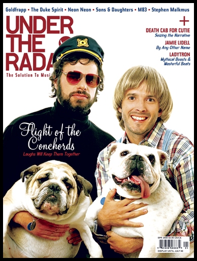
Photographs: There is usually only one photograph on the cover per issue and details the mainsell. In this issue it is of The Dodos who are in the best of 2008 Indie bands. This fully draws the attention of the reader to the band and therefore the main sell of the magazine, fulfilling the key goal that Indie magazines strive for; allowing the content to do the talking. The shot is of the band stood together, wearing average clothes, and is a mid-long-shot. Their hands are in their pockets and the have a generally relaxed disposition. This could connote openness and familiarity with the reader, as if they themselves can get in touch and have a normal conversation with any of them personally rather than the representatives of mainstream artists like Girls Aloud. The typical Indie clothes and hairstyles, long hair and beards with tight fitting tops and waistcoats, are all shown thus identifying the magazine as Indie. The plain background allows the audience to focus fully on the band and therefore the mainsell. This also links in with the Indie genre as it allows the content of the magazine and more importantly the artists themselves to take centre stage.


Other examples of Under the Radar covers are:


Contents page: The layout is simple, the contents text is mainly on the right hand side and photographs showing the articles that are inside the magazine are on the left. The photographs range in size and are placed together in a collage like format. This gives the magazine a fun exciting element and makes it different from other magazines which therefore will appeal to the radical, hedonists who read Under The Radar. The small page numbers in the top right hand corner of each picture tell them where they can find each article so that they do not have to read lots of text and flick through lots of pages. A small note form the editor, along with a small picture of the current issues cover, is placed at the bottom of the page along with offers on subscription. The note form the editor gives the magazine a more personal feel as the reader feels more close to the people who make and run the magazine. It connotes a sense of friendship and familiarity and by using short, informal language it suggest a young, fun and exciting element. The size of the note also allows the reader to read it quickly and focus their attention on the main magazine itself. The top right hand corner there is the title Under The Radar along with it's trademark, thus also establishing a brand name and image among the readers and the indie music scene. The contents is spilt into section underneath it's own heading e.g. Reviews, News and Features. This breaks up the text, making it look less reading for the reader and also suggesting a professional side to the magazine. The text is all done using a sans sherif font and uses similar language as the cover to address the audience. This provides a baseline fro the rest of the magazine to follow and therefore cementing it's trademark and brand image. The sans sherif font also connotes a more fun, laid back and causal style to the magazine.

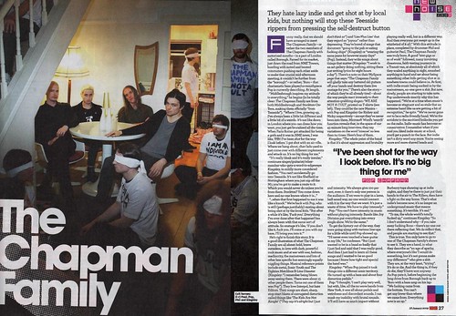
Double Page Spread: The double page spread from the Under The Radar magazine is an interview with famous Indie band In The Thick of It. The main picture in the article takes up the whole left hand side of the page and a smaller one fills the top third of the right hand one. The pictures are simple, the artist is wearing a casual red top and black jeans and the background is plain with no pictures on the walls or fancy wall paper etc. This works well with the Indie genre as it does not distract the reader from the article itself and uses no over the top or expensive photo shoots to get their pictures. The photos also connote laid back, friendly and openness to the reader and this is similarly done by the artist looking directly at the reader and directly addressing them. This stare however could also be considered threatening. The article title is done using sans sherif font and simple one colour designs. This also allows the reader to concentrate on the article rather than the design features. The text used is informal, appealing to their younger audiences and the start of the text paragraph is the same peachy colour as the article masthead. This links in with the articles simple design and develops the brand image further by complimenting the colours used in the text with the clothes worn by the artists. The only part of the page that is different and more colourful is the small Best Of The Decade text that is in the coverline. This could be considered a puff as it biggs up the magazine and offers something new, different and cool to the readers. The rain bowed design could connote it's importance as it draws in the readers eye and stands out from the contrast of the dull colours in the text and photographs. It could also connote a young, exciting and lively feel to the magazine. The sans sherif font connotes a more laid back and relaxed air to the magazine whilst the informal language appeals to the younger less mature audiences as it connotes a youthful and exciting element to the magazine.


Publisher/Distributor: Under The Radar is both published and distributed by themselves.


Wednesday 30 December 2009

Detailed Research into Forms and Conventions Part 2- NME

The second magazine that I will research into is NME.

Brief Introduction: NME (real name the New Musical Express) is a music magazine, published in the UK and had it’s first issue published in March 1952. It is published weekly and has a circulation of over 40,000. NME was the first British music magazine to include a singles chart and it was famous for being published in a non-glossy tabloid format on standard newsprint. However since 1998 onwards, the paper has been no longer been printed on newsprint and now favours a more modern full, glossy, colour covers. It is sold weekly for £2.30.

Other media:
  • NME Radio - dedicated to play only rock and indie music
  • NME Awards - an awards show held every year to celebrate the best new music of the past year. The nominations and eventual winners are voted for by the readers of the magazine.
  • NME Tours - a tour of the United Kingdom by up-and-coming bands each year.
  • NME TV
  • NME.COM - site with podcasts, interviews, blogs, readers comment and exclusive playlists
  • NME Originals - a series of themed magazines reprinting vintage articles, interviews and reviews from the NME archives. Notable issues so far have featured The Beatles, Radiohead and Nirvanna.

Research:

Audience: Mainly males aged 17-30, with a jicnars scale of B/C1 and a psychographic profile of Hedonists, Radicals and Post Materialists. They are slightly more mature and older than Kerrang! readers, they may have a normal business job yet on weekends and days off they wear dark coloured tops and loose jeans; prefer crowded underground gigs than to sell out Wembley concerts. They party all night and do not mind reading long articles and interviews inside the magazine with their favourite band.

The statistics for readers of NME are:
  • Male - 73%
  • Female - 27%
  • Average Age - 25
  • ABC1 73%
  • Target Market Men 17-30
  • They are entertainment enthusiasts with 80% of NME readers feel that music is an important part of their lives.
  • 49% specially choose to listen to live bands in studio and 52% are interested in taking a musical course/qualification.
  • Almost half (49%) have been reading NME for at least 3 years with 84% think the magazine gives them what they want, spending an average of 46 minutes reading each issue.
  • They are good with technology 93% own a computer with 96% have access to the Internet


Title: The masthead is big, bold (in capital letters) and uses sans sherif font. The title NME is short, sharp to the point which allows it to stand out from the other magazines on the shelf as it rolls off the tongue and therefore is easy to remember. This masthead links in with the genre of music as it takes nothing away from the actual music itself and merely gives artists and bands a chance to promote their songs. The name also gives the audience something to identify with and with NME having a decorated history within the rock music scene many fans will buy the magazine to have a small copy of memorabilia whilst others may buy copies to feel part of a group or fan base. The short brand name appeals to their target audience as it connotes a sense of cool and trendiness. Similarly the easiest and most efficient way to promote the magazine is through word of mouth which teenagers do the most effectively out of any major age group. The bold capital letters connote excitement and importance with the reversed out red letters with a white border connotes danger. However it could also connote that beneath the normal run of the mill cover (symbolised by the white border) there is a more dangerous, rebellious and excitement inside. They are bold colours with draw the readers eye and make it easier to see over the fairly dull cover photographs. By using these colours they are appealing to their target audience of 17-30 year old men as the dangerous or rebellious side will draw them to the magazine, as young men will find the danger a thrill and exciting.


Style: The main colours used in NME are black, red and white. They are bold yet slightly dull and bland, however this links back to the genre of the music and of the magazine as these dull colours do nothing for the reader and bring their focus solely on the articles or musicians inside the magazine. For rock/indie music lovers, music is the key and not the way that it is presented. This is also shown by the simple font style and general layout of the magazine e.g. photographs
and coverlines. The photographs are few and far between and are placed evenly (i.e. none overlapping or at odd angles) and the short, simple straplines underneath allow the reader to get the general idea of the articles inside without having to read a lot of information. This will appeal to their target audience as if they have busy work lives or not so much free time they did not want to be reading a lot of information or be overwhelmed when taking a general look at the cover. The background colours of dull greys and blacks allow the bright red and whites to shine through and appear more bright as a result. This therefore draws in the readers eye and connote a sense of danger and excitement to the magazine.


Content: Readers of NME don't have a problem with upsetting the natural order of things and saying or doing something radical. Therefore in this magazine you would expect articles that may be out of the ordinary e.g. speaking flippantly about drug or alcohol abuse. This is shown in the December 2009 issue when Noel from the Mighty Boosh titles his articles 'My penis turned black!' or the main Babyshambles article entitled 'The band that came back from the dead.' Also inside the magazine there may be articles about recent gigs, music news and interviews with musicians ranging from new and upcoming artists to well known recognisable bands such as Razorlight or The Ramones. To help upcoming bands they regularly include long interviews or gig/album reviews about them in the hope of gaining the public awareness. NME also has the reputation for its buyers having pages of NME over their bedrooms walls as a loyalty to the magazine therefore they regularly have pictures or hot new bands that readers can simply tear out and stick to their walls, this not only promotes new bands but also give NME an edge over the competition. NME also include the top 20 rock/indie chart along with hot new, current music that is popular, these include articles from band members such as Johnathan Pierce from The Drums. NME prides itself on it's audience enjoyment and dedicate a double page spread to all the letters that they receive from the public.


Mode of address: In general the magazine does not address the reader directly. There is no use of you, I or we nor of any punctuation marks such as question marks that similarly address or engage the reader personally. By doing this the reader does not get to involved in the magazine personally and also concentrates on the music rather than having to think about their own opinions etc. The magazine uses standard English, no shortened or text speak, and this targets their target audience of more mature males aged between 19-30. The words are short and sharp as this gets straight to the point and saves the reader from having to take in a lot of information at one time and gives the reader the gist of the magazine articles.

Photographs: The main photograph is of the band Babyshambles. They are stood in what looks like an old abandoned basement and the band are also wearing dark, grimy clothes. The photograph is a mid-long shot and shows the band from just below the waist upwards. The dark setting, grimy almost dirty looking clothes and unkempt appearance fit in well with the genre of the magazine as this beaks away from the social norms and values on a clean and tidy appearance given to the audience by mainstream music magazines like FADER and Mixmag. This could also connote rebellion, therefore giving the audience a sense of coolness and fun to the band and therefore the magazine. Many NME readers strive to be different from the mainstream and therefore this unkempt look fits in perfectly, giving the band a bigger fan base throughout the rock/indie seen.The group are all stood close together and have their arms around each other, this suggests openness and friendship yet also a sense of familiarity and vulnerability with the audience. The band members are all looking straight ahead, directly at the audience, fixing them is an 'icy stare'. This could be a method to engage the audience and try to make the magazine more personal and draws them into buy the magazine showing openness, yet it could also connote distrust and an almost confrontational look. This look could also suggest the importance of the article and the strapline. The background is plain which allows the audience to concentrate fully on the music and the articles within rather than fancy scenery and props, fitting in with the music genre. The other two smaller photographs connote a similar sense of openness as they stare directly at the audience and have similar clothes and plain backgrounds to fit in with the rock/indie scene.


Contents: The contents page in NME is plain with a simple 'What's Inside' column on the left hand side of the page. The article names are in red and the page numbers in black which stand out from the plain white background. Along the bottom of the page there is a large advert detailing the subscription offers for readers telling them how much they can save if they buy in bulk rather than issue by issue. This banner is black with white and gold writing. It also includes a small photograph of other issue from NME. The majority of the page is taken up by the image of Florence Welch meeting Jarvis Cocker. This format is similar to tabloid newspapers as on the first page they also have a small article about recent events. This links in with their target audience as the more mature men will see the magazine as a form of newspaper, like in the 70's and 80's, and therefore relate much more easily than the other mainstream gossip music magazines. However to appeal to a more younger audience they use informal language such as Xmas and Snapshot to connote a more fun and young feel to the magazine. The general simplicity of the magazine links well to the genre of rock/indie music as the simple design and layout, no even titles or sub headings, no bright bright colours and overlapping pictures or text, allows the reader to fully concentrate on the music and the articles. This to indie lovers is what's the most important. The bold colours show that NME know what they are aiming for and what to do to get it. The red, black and white connote a form of good vs. evil and excitement and danger. This will appeal to the target audience as they will find this danger and rebellion exciting and fun. The gold however is only included in the banner for subscription and could connote money and wealth. As indie music focus on the the music and not the money they rarely use gold in their articles. This therefore could draw the readers eye toward the banner and persuade them to buy into a subscription thus maximising profit and giving NME a number of confirmed sales for each issue.

Double Page Spread: The double page spread is focused on new indie band The Chapman Family. The left page is centred on the band itself, who are shot sat at a crowded table in a house party. The shot is a long shot and everyone but the band members are wearing white headbands around their eyes. This could connote the naivety of others when they look at indie bands and also show the false conscious of what the mainstream music magazine have given people about the genre. The colour could also symbolise their purity away from outside media influences. The house itself is plain with no pictures and hardly any fixtures or furniture. This draws the readers attention to the band itself and not on the background. This is also shown by the dark colours surrounding them. This is so the audience concentrate on the band and their music only rather than be distracted by bright colours or loads happening in the photo. They way that the band is sat alone at the table could connote loneliness, vulnerability and them being outsiders. This also could symbolise the way that Indie music is stereotyped and placed outside the mainstream industry. They are wearing typical indie clothes compared to the others in the house who are wearing simple jeans and shirts. This also helps to show the reader the dramatic differences between the two cultures and genres of music.

The right hand side of the page is dedicated to the article itself and uses informal language, such as 'New Noise', to try and appeal to a larger and younger audience. The article is detailed and methodical, set out similar to a newspaper article with the small font, key parts of the article highlighted and placed in the middle of the text and the use of some bright colours such as purple and pink to try and draw the readers attention. This appeals once more to their target audience of more mature males as they will easily realte to the tabloid format and simple yet effective layout.


Publisher: IPC IGNITE


Distributor: Marketforce

Thursday 24 December 2009

Detailed Research into Forms and Conventions: Part one - Kerrang!

The first magazine that I will be researching is Kerrang!

Brief Introduction:
Kerrang! is published by Bauer Media and is a rock music magazine based in the United Kingdom. The magazine's name derives from the sound made when playing a power cord on an electric guitar. Kerrang! was first published on 6 June 1981 and since then has produced international issues in Australia and Spain, whilst also expandingg their product into different forms of media including their own music channel, set of awards (Kerrang! Awards), own radio stations, website (www.kerrang.com), messageboards, online shop, podcasts and tour. Kerrang! magazine sells for £2.20 and is issued weekly with a total circulation of 52,000.

Research:

Genre: Rock

Audience: 18-24, mainly students or people with a disposable income. Jicnars of C2/D and psychographic of radicals, hedonists and post-materialists. On the other hand some of the posters of male bands and artists could similarly attract a female audience. They wear skinny jeans and dark coloured tops and sliver jewellary; have long hair and prefer crowded underground gigs than to sell out Wembley concerts.

This is proven by the statistics of the readers of Kerrang!;
MALE 69%
FEMALE 31%
AVERAGE AGE 24
WORKING FULL TIME 52%
WORKING PART TIME 7%
STILL STUDYING 29%


Title: The title is big, bold and uses sans sherif font. The masthead has a broken and disjointed effect that gives the magazine an edge and connotes a rebellion against the mainstream, almost like they are breaking away (hence the broken masthead). They use bright colours, such as red, black and white, to attract their audience. This could connote danger and excitement, which most people argue that rock music itself symbolises. The effect of the masthead and the reversed out coverlines which randomly placed on the front cover, tries to break from the mainstream much like rock/indie music tries to break away from the mainstream pop and R’N’B. The screamer connotes a sense of excitement and the stamped effect gives the magazine a more urban and underground feel, almost resembling the stamps that people get on their hands when they leave a nightclub so that they are allowed back in. This similarly separates Kerrang! from the mainstream mastheads of a printed like masthead like FADER and Classic FM.


Style: The style of the magazine is quite busy with a lot of coverlines and extras covering it. This connotes that the magazine has a lot of things inside and that it is value for money which attracts their audience as students do not have much spare income. The font styles for all of the coverlines is generally bold and in capitals, however there are some that look stamped much like the masthead, which also connote a laidback, underground urban feel to the magazine. To further show their independence from the mainstream music magazines by highlighting key words such as ‘not’ in the strapline for their mainsell, ‘We’re not doing things to please people’. This connotes the importance of the sentence and the importance of being different and individual from others, something that rock and indie music strives to be. The colours used in the covers are usually dark, e.g. black, red and gold. This could connote danger, risk, excitement and an adrenaline rush as black could symbolise evil, red - blood and gold the reward afterward e.g. money etc. This would appeal to the target audience as in general young people like to take risks and just have fun, something that rock music symbolises and strives to be. 'DIFFERENT FROM THE MAINSTREAM!'


Content: Inside the magazine there are interviews with such artists such as Paramore and 30 Seconds to Mars rather than Leona Lewis or Beyonce. Kerrang! is also well known for provide pull out posters of famous rock bands or artists that the readers can hang on their walls, therefore throughout the magazine there are large pictures and double page spread posters that readers can decorate their walls with. As Kerrang! focuses on the reader's enjoyment and involovement there are many reader polls and reviews throughout the magazine. The articles have a range of different artists, not carbon copies like Leona Lewis and Alexandra Burke, that will say what they want and when they want to. The use of words such as ‘Exclusive’ and ‘Plus’ also connote an air of speciality that you can’t get with other magazines, which will also attract their audience to the magazine if they believe that they are getting something different form other magazines.


Mode of address: Kerrang! Uses short, sharp informal language to target their audience of young people aged between 15-24 and C2/D on the Jicnars scale. The short straplines and coverlines attract the audience as they can quickly scan read the main articles of the magazine without taking a lot of time. They would use direct language to target their audience head on and prise themselves on using the public feedback to make their magazine better and therefore more attractive to their audience as they feel that their opinons matter about their favourite magazine. This also makes the magazine more personal to the reader and the audience as they feel that they have had a say about the issues in the magazine.

Photographs: The main photo is of the band itself, Biffy Clyro. The shot type is mid shot and shows the three wearing classic causal indie/rock style clothes including; loose tops, black jackets, hats and tight bitten down shirts. This connotes relaxation and being laidback, which helps the audience see them as real human beings that they can see, hear and talk to in real life rather than the generic pop star that the closest a fan can get to is buy watching them on the TV. This similarly connotes openness and honesty which the fans will relate to. They are looking straight ahead, a direct gaze on the person, fixing them with a ‘icy’ stare. This could connote one of two things; openness as they are focusing their attention on the audience or confrontational. The direct gaze could also draw the audience in as by doing this it forms a certain bonds with the reader and therefore persuading them to buy the magazine. This could also suggest the importance of the article and the strapline. The background is plain which allows the audience to concentrate fully on the music and the articles within rather than fancy scenery and props. The front man taking of his jacket connotes a familiarity with the audience and forms a bond as he feels so comfortable and relaxed with them that he allows his jacket to come off. This could connote openness and vulnerability.


Contents: The title ‘Contents’ and the other sub titles are written in yellow, with the title surrounded by black. This could connote danger, or as the colours are inverted, it could symbolise the supposed danger of the magazine and the music genre. The magazine uses informal language such as ‘We ‘heart!’ Biffy Clyro’ to make the magazine seem more reader friendly and helps to provide a connection to the audience, making the editor seem more down to earth and real, someone who the readers will be able to contact easily and directly. The contents list is short intros, mostly one or two words, allowing the reader to find the story or article that they are looking for easily and quickly without having to look through a lot of writing. Many of these are similarly done in sans sherif, informal font, e.g. Swag and K! Icons, which connote a laid back, off the record and fun magazine for readers of any age and background. Kerrang regularly uses audience and reader feedback in their magazine, normally the readers will write a short review of a band’s live performance, album or songs which is included in the next issue. The feedback is placed on the first few pages of the magazine, which connotes that Kerrang puts their fans views first and are more important than the band interviews inside. In the top left, alongside the editor’s note, there is a small picture of the front cover with the bottom right hand corner dedicated to subscription and orders of back issues. This is a classic magazine ploys that are used to further promote the magazine to the audience and with the special promotions for the subscription give them an added insensitive to buy the subscription directly from the distributors. Finally the main focus of the contents page is the smaller photographs of the other articles in the magazine. Roughly between 8-10 pictures, the main sell primarily the largest picture of the group, and along with the page number, done in the same way as the contents page headline, a small intro and the article headline. The headline done in a thick bold font and the intro in a smaller, thinner non bold font which immediately draws the audience’s attention to the title of the article rather than the intro. This also provides a way of showing off all of the many different and individual articles that they have in the magazine and gives the preferred reading that there is something for everyone and also that there is a lot going on in this magazine.


Double Page Spread:
The double page spread is centred around Fall Out Boy and their private Kerrang sponsored gig. The main focus of the article is the large pictures of the band. They are MLS and an interesting design feature is that they are took in black and white. This connotes an dark and depressing side to the music and it could even connote an old fashioned edge as it is done completely without colour. They have classic rock/indie poses as they are both playing electric guitars and are not fully facing the audience and looking directly at the guitars. This could connote a dark and coldness from the group yet it could also indicate that they are focused only on the music rather than trying to build a relationship with the many fans. The title is done using a sans sherif font that is coloured red at the top of the words and white at the bottom. The red is slowly dripping onto the white, connoting blood and therefore danger, death and violence. The words of ‘Anything could happen’ also connotes danger and fear as it may symbolise fights and shows of violence at the concert. This would attract their audience as this connotation of violence, that is made to seem cool, separates itself from articles in mainstream magazines who persuade it’s readers’ to discourage violence, something that indie/rock has been known to do. Similarly the first letter of the main article is also in blood red and the small insert in the bottom right hand corner, promoting free tickets to see Fall Out Boy, is also done in red. Likewise with the main title, this colour could symbolise blood, therefore connoting death, destruction and violence. However the writing of the article is done in white, therefore connoting a pure, innocent side to the band. This could also make them appear more trustworthy and therefore making the fans believe that they won’t change and sell out to big name labels. The white on the black clothing of the band also provide a contrast from which the readers’ can base their own opinions on whether the band is good or not. This allows the reader to make their own judgement and opinions on the band and the articles, giving them options rather than force feeding the readers new copycat generic artists like Leona Lewis and Alexandra Burke. This contrast between the background of the article and the writing, also brings out and draws the attention to the article rather than the picture, the competition and from the other articles. This fits on well with the magazine philosophy of concentrating more about the music and about the welfare of the ban as a whole rather than money.


Publisher:
Polestar


Distributor: Frontline

Sunday 13 December 2009

Introduction into 'Detailed Research into Forms and Conventions'

For my final music magazine piece of coursework I have chosen to focus on designing and making a Rock/Indie music magazine. To research into this genre I looked into three main rock and indie magazines that are in publication today; KERRANG!, NME and Under The Radar. This research allows me to have a closer look in the market of a rock/indie magazine, to see if there is a gap in the market and to see how, and if, my magazine will fit into the competitive area of the music magazine industry.

Target Audience: The target audience for my product is mainly males, aged between 15-24, generally students or people will a disposable income and a rating of around C2/D on the Jicnars scale. My target audience also have a psychographic profile of radicals, materalists, hedonists, post materialists and post modernists. They would rather go to a free rock gig than a classical musical concert, see rough, unsigned bands instead of the cinema, drink beer instead of wine and party all night.

Friday 11 December 2009

Initial Research into Forms and Conventions

For the first part of my Media Studies coursework I looked into three different types of music magazine; Rock/Indie, Classical and Dance. By looking into these different music magazines I was able to see which genre of music I would like to design my magazine around, how they use specific conventions to target their audience. This will help me discover whether there is a gap in the market for my new magazine and in which sub-genre my magazine will be based in.


The first magazine I looked at was dance magazine; Mixmag.The layout is simple, with big bright colours to make it different from all the other magazines on the shelf and really draw in the audiences eye. The use of bright colours also help to connote a sense of fun and liveliness. The sans sherif font connotes a fun, unsophisticated and informalness that comes with the magazine allowing it to appeal to their target audience of C2/D, similarly this is done by using short, sharp and informal language for the reversed out coverlines and other selling points to the magazine. The puff and freebie at the top of the cover also helps to appeal to it's audience as students or people with limited disposable income with enjoy the free CD and the borrowed value of owning 'The World's Best Dance Music Magazine'. The main sell is the interview with Goldfrapp. The photo is a MLS which allows the reader to see all of what she is wearing. The silk tied jacket, which is open to show that she is wearing revealing black underwear connotes a fun, exciting and sexy side to the magazine and to dance music. This will also push their audience into wearing provocative clothing as it makes them 'true' to the genre. The grey retro record player that is in the corner shows that dance music is both coll, hip and funky whilst still being retro, thus widening the audience for people who like the older retro versions of dance music.


The second magazine I looked at was BBC Music magazine. This magazine focuses on classical music with articles and features on world and jazz music. The layout is simple, the main sell clear, big, bold and easy to spot as it is coloured completely differently from the other articles that are shown on the front cover. The MS of Sarah Chang, the famous violinist, is shown wearing a conservative dress which connotes the sophisticated and classy tone of the magazine. This is similarly shown by her holding a violin, a very classy and sophisticated instrument and immediately discourages the general mainstream audiences who enjoy pop and R'n'B rather than classical music.
The cover is set colours of white, with hints of red, yellow and black. This, whilst doing little to attract a range of audiences, allows only the true enthusiasts of classical music to buy the magazine. The cover uses formal language and a sherif font to add to the sophistication, intellectual and classiness of the magazine. The puff and freebie at the top of the magazine also provide another level of enjoyment in owning the magazine. The puff gives the person a sense of borrowed value from the magazine as they own a copy of 'The world's best selling classical music magazine'. These features all appeal to their target audience of A/B on the Jicnars scale and of succeeders and achievers. The other reversed out straplines are smaller and less bold then the main sell but focus on the best composers rather than the latest pop acts. Likewise inside the magazine there are articles on classical music lessons, buying and selling classical music instruments and articles on famous composers, the latest news and reviews on classical, world or jazz musical albums.


The final magazine that I looked at was Kerrang!, the well known rock/indie music magazine. The target audience for this magazine was males aged between 15-24, mainly college students with a disposable income and a rating of C2/D on the Jicnars scale. The bold and big masthead at the top of the front cover, with a sans sherif font connotes a strong and masculine air to the magazine, whilst the broken and disjointed letters suggests danger, violence and that the music what the magazine connotes maybe dark and sinister. The coverlines, reversed out and otherwise, are at a disjointed angle which gives the impression of rejecting the norm and trying to be different and original, rather than the carbon copies of other more mainstream magazines. This appeals to the target audience as they also want to be seen reject the norm and challenging the mainstream. The bold and set colours of blue, white, black and yellow also suggest masculinity and power, targeting a male audience more than a female one. The writing is short, sharp and to the point which appeals to it's audience of C2/D hedonists and also connotes a sense of fun, action and excitement to the magazine. Other features such as the competitions and exclusive interviews with famous rock stars such as Ozzy Osbourne similarly attract their audience to the magazine as these exclusive promotions are special to them giving them extra angles over it's competitors. The MS of the famous Welsh rock/indie group The Lostprophets, all dressed in classic rock outfits of black leather jackets and metal necklaces, staring blankly ahead. The way in which they are staring connotes a masculine, powerful and almost confrontational manner, this likewise targets a more male audience who look up to the band and will imitate their behaviour and clothing. The inclusion of exclamation marks and key words such as 'Special', 'Exclusive', 'Plus' and 'Massive' also suggest the importance or the magazine's articles and will likewise attract their audience as they are all positive words and try to offer something different to the public.

Thursday 10 December 2009

Main Task:Magazines

For my main Media AS coursework I will be designing and making my own front cover, contents page and double page spread for a new music magazine in the genre of my choice. I will have to choose a genre of music to focus on, choose my own band or artist that isn't signed to a record label and interview and take pictures of them. To complete this project successfully I need to keep to the important deadlines such as completing all of the research and planning by the 8th of January, finishing the production of the magazine (such as the pictures and fonts for the front cover) by the 15th January, the post production by the 12th of February and finally the evaluation by the 5th March. If I keep to these deadlines and if my planning and organisation is correct then my main magazine coursework (the front page, contents page, double page spread and the evaluation) will be complete in time for the 5th March.