Brief Introduction: Kerrang! is published by Bauer Media and is a rock music magazine based in the United Kingdom. The magazine's name derives from the sound made when playing a power cord on an electric guitar. Kerrang! was first published on 6 June 1981 and since then has produced international issues in Australia and Spain, whilst also expandingg their product into different forms of media including their own music channel, set of awards (Kerrang! Awards), own radio stations, website (www.kerrang.com), messageboards, online shop, podcasts and tour. Kerrang! magazine sells for £2.20 and is issued weekly with a total circulation of 52,000.
Research:
Genre: Rock
Audience: 18-24, mainly students or people with a disposable income. Jicnars of C2/D and psychographic of radicals, hedonists and post-materialists. On the other hand some of the posters of male bands and artists could similarly attract a female audience. They wear skinny jeans and dark coloured tops and sliver jewellary; have long hair and prefer crowded underground gigs than to sell out Wembley concerts.
This is proven by the statistics of the readers of Kerrang!;
MALE 69%
FEMALE 31%
AVERAGE AGE 24
WORKING FULL TIME 52%
WORKING PART TIME 7%
STILL STUDYING 29%

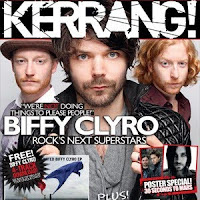
Title: The title is big, bold and uses sans sherif font. The masthead has a broken and disjointed effect that gives the magazine an edge and connotes a rebellion against the mainstream, almost like they are breaking away (hence the broken masthead). They use bright colours, such as red, black and white, to attract their audience. This could connote danger and excitement, which most people argue that rock music itself symbolises. The effect of the masthead and the reversed out coverlines which randomly placed on the front cover, tries to break from the mainstream much like rock/indie music tries to break away from the mainstream pop and R’N’B. The screamer connotes a sense of excitement and the stamped effect gives the magazine a more urban and underground feel, almost resembling the stamps that people get on their hands when they leave a nightclub so that they are allowed back in. This similarly separates Kerrang! from the mainstream mastheads of a printed like masthead like FADER and Classic FM.

Style: The style of the magazine is quite busy with a lot of coverlines and extras covering it. This connotes that the magazine has a lot of things inside and that it is value for money which attracts their audience as students do not have much spare income. The font styles for all of the coverlines is generally bold and in capitals, however there are some that look stamped much like the masthead, which also connote a laidback, underground urban feel to the magazine. To further show their independence from the mainstream music magazines by highlighting key words such as ‘not’ in the strapline for their mainsell, ‘We’re not doing things to please people’. This connotes the importance of the sentence and the importance of being different and individual from others, something that rock and indie music strives to be. The colours used in the covers are usually dark, e.g. black, red and gold. This could connote danger, risk, excitement and an adrenaline rush as black could symbolise evil, red - blood and gold the reward afterward e.g. money etc. This would appeal to the target audience as in general young people like to take risks and just have fun, something that rock music symbolises and strives to be. 'DIFFERENT FROM THE MAINSTREAM!'

Content: Inside the magazine there are interviews with such artists such as Paramore and 30 Seconds to Mars rather than Leona Lewis or Beyonce. Kerrang! is also well known for provide pull out posters of famous rock bands or artists that the readers can hang on their walls, therefore throughout the magazine there are large pictures and double page spread posters that readers can decorate their walls with. As Kerrang! focuses on the reader's enjoyment and involovement there are many reader polls and reviews throughout the magazine. The articles have a range of different artists, not carbon copies like Leona Lewis and Alexandra Burke, that will say what they want and when they want to. The use of words such as ‘Exclusive’ and ‘Plus’ also connote an air of speciality that you can’t get with other magazines, which will also attract their audience to the magazine if they believe that they are getting something different form other magazines.
Mode of address: Kerrang! Uses short, sharp informal language to target their audience of young people aged between 15-24 and C2/D on the Jicnars scale. The short straplines and coverlines attract the audience as they can quickly scan read the main articles of the magazine without taking a lot of time. They would use direct language to target their audience head on and prise themselves on using the public feedback to make their magazine better and therefore more attractive to their audience as they feel that their opinons matter about their favourite magazine. This also makes the magazine more personal to the reader and the audience as they feel that they have had a say about the issues in the magazine.
Photographs: The main photo is of the band itself, Biffy Clyro. The shot type is mid shot and shows the three wearing classic causal indie/rock style clothes including; loose tops, black jackets, hats and tight bitten down shirts. This connotes relaxation and being laidback, which helps the audience see them as real human beings that they can see, hear and talk to in real life rather than the generic pop star that the closest a fan can get to is buy watching them on the TV. This similarly connotes openness and honesty which the fans will relate to. They are looking straight ahead, a direct gaze on the person, fixing them with a ‘icy’ stare. This could connote one of two things; openness as they are focusing their attention on the audience or confrontational. The direct gaze could also draw the audience in as by doing this it forms a certain bonds with the reader and therefore persuading them to buy the magazine. This could also suggest the importance of the article and the strapline. The background is plain which allows the audience to concentrate fully on the music and the articles within rather than fancy scenery and props. The front man taking of his jacket connotes a familiarity with the audience and forms a bond as he feels so comfortable and relaxed with them that he allows his jacket to come off. This could connote openness and vulnerability.
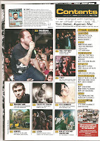
Contents: The title ‘Contents’ and the other sub titles are written in yellow, with the title surrounded by black. This could connote danger, or as the colours are inverted, it could symbolise the supposed danger of the magazine and the music genre. The magazine uses informal language such as ‘We ‘heart!’ Biffy Clyro’ to make the magazine seem more reader friendly and helps to provide a connection to the audience, making the editor seem more down to earth and real, someone who the readers will be able to contact easily and directly. The contents list is short intros, mostly one or two words, allowing the reader to find the story or article that they are looking for easily and quickly without having to look through a lot of writing. Many of these are similarly done in sans sherif, informal font, e.g. Swag and K! Icons, which connote a laid back, off the record and fun magazine for readers of any age and background. Kerrang regularly uses audience and reader feedback in their magazine, normally the readers will write a short review of a band’s live performance, album or songs which is included in the next issue. The feedback is placed on the first few pages of the magazine, which connotes that Kerrang puts their fans views first and are more important than the band interviews inside. In the top left, alongside the editor’s note, there is a small picture of the front cover with the bottom right hand corner dedicated to subscription and orders of back issues. This is a classic magazine ploys that are used to further promote the magazine to the audience and with the special promotions for the subscription give them an added insensitive to buy the subscription directly from the distributors. Finally the main focus of the contents page is the smaller photographs of the other articles in the magazine. Roughly between 8-10 pictures, the main sell primarily the largest picture of the group, and along with the page number, done in the same way as the contents page headline, a small intro and the article headline. The headline done in a thick bold font and the intro in a smaller, thinner non bold font which immediately draws the audience’s attention to the title of the article rather than the intro. This also provides a way of showing off all of the many different and individual articles that they have in the magazine and gives the preferred reading that there is something for everyone and also that there is a lot going on in this magazine.


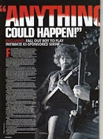
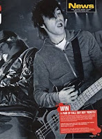
Double Page Spread: The double page spread is centred around Fall Out Boy and their private Kerrang sponsored gig. The main focus of the article is the large pictures of the band. They are MLS and an interesting design feature is that they are took in black and white. This connotes an dark and depressing side to the music and it could even connote an old fashioned edge as it is done completely without colour. They have classic rock/indie poses as they are both playing electric guitars and are not fully facing the audience and looking directly at the guitars. This could connote a dark and coldness from the group yet it could also indicate that they are focused only on the music rather than trying to build a relationship with the many fans. The title is done using a sans sherif font that is coloured red at the top of the words and white at the bottom. The red is slowly dripping onto the white, connoting blood and therefore danger, death and violence. The words of ‘Anything could happen’ also connotes danger and fear as it may symbolise fights and shows of violence at the concert. This would attract their audience as this connotation of violence, that is made to seem cool, separates itself from articles in mainstream magazines who persuade it’s readers’ to discourage violence, something that indie/rock has been known to do. Similarly the first letter of the main article is also in blood red and the small insert in the bottom right hand corner, promoting free tickets to see Fall Out Boy, is also done in red. Likewise with the main title, this colour could symbolise blood, therefore connoting death, destruction and violence. However the writing of the article is done in white, therefore connoting a pure, innocent side to the band. This could also make them appear more trustworthy and therefore making the fans believe that they won’t change and sell out to big name labels. The white on the black clothing of the band also provide a contrast from which the readers’ can base their own opinions on whether the band is good or not. This allows the reader to make their own judgement and opinions on the band and the articles, giving them options rather than force feeding the readers new copycat generic artists like Leona Lewis and Alexandra Burke. This contrast between the background of the article and the writing, also brings out and draws the attention to the article rather than the picture, the competition and from the other articles. This fits on well with the magazine philosophy of concentrating more about the music and about the welfare of the ban as a whole rather than money.
Publisher: Polestar
Distributor: Frontline

No comments:
Post a Comment